Indoor plants crystal styling
Botanical Synergy: Styling Dark Stones with Indoor Greens
Dark stones work best with indoor greens when the plant’s light needs choose the location, and the stones follow as a visual anchor. For indoor plants crystal styling, start with the window, shelf, or corner where the plant can live well, then use black tourmaline, schorl, basalt-like pebbles, or other dark specimens for contrast, weight, and texture.
Keep the arrangement practical. Stones should not cover drainage paths, press against stems, hide the soil surface so completely that you cannot check moisture, or sit within easy reach of pets or young children. The point is a calm plant-and-mineral vignette, not a display that makes plant care harder.
broader context
Black tourmaline context note
This narrower page works best after the broader black tourmaline context page.
Start With Light, Not the Stone
A good plant-and-stone arrangement begins with the plant’s actual light conditions. University extension guidance on indoor plants treats light intensity, duration, direction, and distance from the source as real placement factors. That matters more than whether the dark stone looks better on the left side of the pot.
North-facing windows are often lower light. East and west windows often give moderate exposure, with morning or afternoon brightness. South-facing windows can be brighter and more intense. Those are useful starting points, not fixed rules; trees, curtains, nearby buildings, season, and climate can change what the plant receives.
For light-aware styling, choose the plant’s position first
- Lower-light-tolerant plants can sit farther from a natural light source, though growth and water use may slow.
- Medium-light plants often suit shelves, stands, and side tables near east or west windows.
- Bright-light plants should stay in brighter positions, with the stones adapting to that spot rather than pulling the plant into a dim corner.
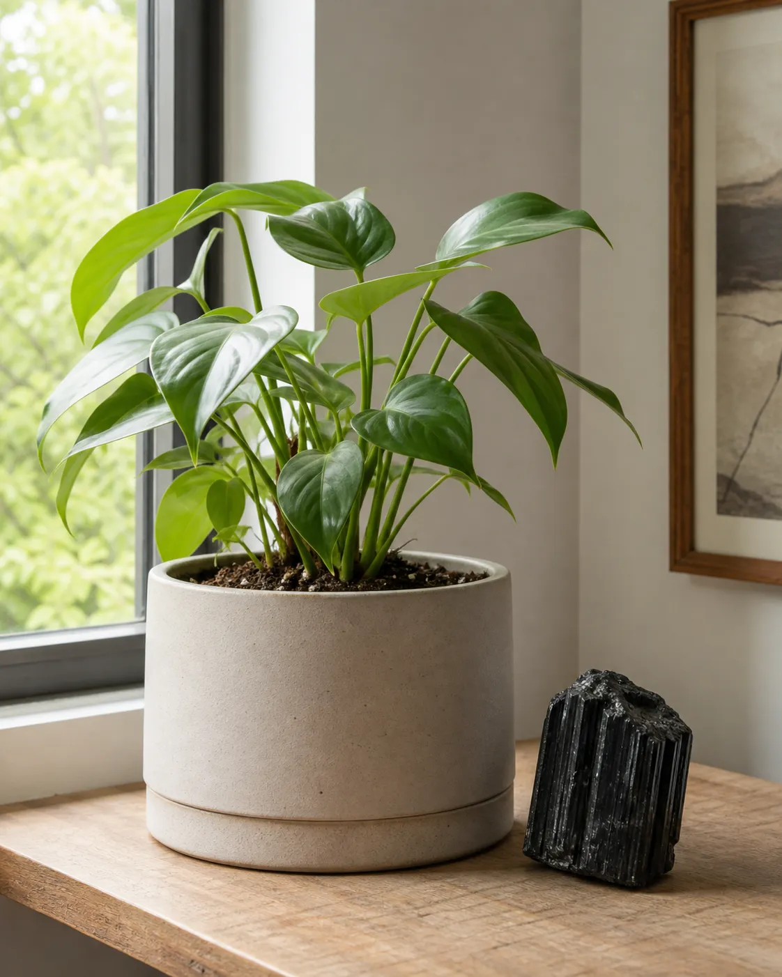
Once the light is settled, the stone can do its design work. A single black tourmaline piece beside a pot can make the composition feel visually grounded through mass, shadow, and contrast. That is a design effect, not a plant-health or body-outcome claim.
Build Contrast Without Crowding the Pot
Dark stones pair well with greenery because they sharpen leaf shape. Matte stones create a quiet, earthy contrast. Glossy stones catch small reflections from a window or lamp and can make the arrangement feel more polished. Striated black tourmaline or schorl adds a linear mineral texture beside rounded leaves, pale ceramic, warm wood, or woven fiber.
The useful design move is restraint. Avoid filling the whole soil surface just because the stones look attractive. Keep the crown, stems, and soil line readable. If the stone layer keeps you from checking moisture, noticing pests, watering evenly, or seeing early stem problems, the display is working against the plant.
This is the tactile part of the arrangement: leaf surface, mineral face, smooth pot, warm wood, shadow. It sounds abstract until you reduce it to what the eye actually reads: texture, height, light, and space.
Use Height, Depth, and Negative Space
A strong indoor plants crystal styling moment rarely comes from lining everything up at one level. Plant displays usually look calmer when they use height variation, visual depth, and a little breathing room.
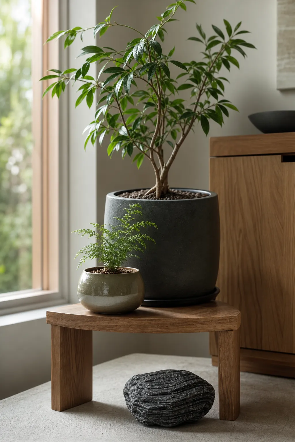
Try three layers instead of one crowded row. A trailing plant on a shelf, a medium pot on a stand, and a low dark stone on a tray can create movement without adding many objects. If the stone is tall or jagged, give it enough room to read as a specimen. If it is glossy and rounded, place it where it catches soft natural light without becoming the loudest object.
Work from back to front
- 1. Put the tallest plant or strongest vertical leaf shape at the back.
- 2. Add a lower pot, book, riser, or tray in the middle.
- 3. Place the dark stone at the front edge or side, where it anchors the scene without hiding foliage.
Near a window, let the plant take the brighter register and let the mineral hold the lower, darker one. Foliage catches light; dark stone supplies weight. That simple division usually looks better than scattering pebbles across every open surface.
Keep Stones Out of Plant-Care Trouble
The common styling error is treating stones as harmless in every position. Many are simple decorative objects, but placement still matters. Stones can make watering harder if they cover soil too densely. Small pebbles can spill. Fragile mineral pieces can chip. Heavy pieces can crack a thin saucer or press into stems.
Avoid placing stones
- Directly against tender stems, where moisture and pressure can collect.
- Over drainage holes or saucer gaps, where water needs to move freely.
- In a thick layer over soil, if it prevents moisture checks.
- On unstable shelves, narrow ledges, or tilted trays.
- Within easy reach of chewing pets or young children.
There is also a wording trap around “crystals.” Some houseplants are listed by botanical or extension resources as poisonous or irritating if chewed, and some contain plant structures such as calcium oxalate crystals. Those are not the same thing as decorative crystals or mineral specimens. If a display is reachable, check plant toxicity through authoritative botanical, extension, veterinary, or poison-control resources rather than relying only on a retailer’s casual label.
A plant may be appropriate for your home while loose small stones still create an ingestion, choking, breakage, or mess concern. In active pet or child zones, choose larger stable pieces, closed cabinets, higher surfaces, or no loose stones.
What Black Tourmaline Adds, and What It Does Not
Black tourmaline appears often in decor and crystal communities because of its dark color, ridged surface, and symbolic associations. Schorl is commonly used in black tourmaline terminology, though this page should not stretch mineral naming into provenance, quality, or authenticity claims. For styling, the most reliable vocabulary is visible: black, striated, matte, glossy, lustrous, rough, columnar, heavy-looking, specimen-like.
Those qualities are enough for interiors. A dark mineral beside a fern, pothos, peperomia, snake plant, or other indoor green can tighten the palette and add a low, tactile note. The arrangement may feel quieter or more grounded to the person looking at it, but that remains a design and personal-meaning statement.
Some social, retail, and metaphysical sources blur the line by suggesting crystals change plant growth, room conditions, or personal outcomes. The source boundary for this page does not support that as horticultural or health information. If symbolic grounding matters to you, treat it as a styling layer: lower placement, heavier texture, dark color, and fewer competing objects. The plant still needs appropriate light, water, air movement, and space.
Schorl before symbolism: name what the material visibly contributes, then leave personal meaning as optional context.
A Simple Placement Sequence
Use this sequence when you want the display to look intentional without turning it into a plant-care project or a crystal altar.
First, choose the plant’s location by light
Stand in the room at different times of day and notice whether the spot is bright, filtered, dim, or exposed to strong direct sun. Match the plant to that condition.
Second, choose the surface
A tray, side table, plant stand, windowsill, shelf, or low bench changes the whole arrangement. If the surface is narrow or already busy, use one stone. If it is broad and quiet, you can create a small grouping.
Third, choose the stone scale
A large pot may need one larger anchor or no stone at all. A small pot can be overwhelmed by a large black tourmaline specimen, especially if the stone competes with the foliage. Scale should feel steady, not theatrical.
Fourth, check the maintenance path
Can you water without moving everything? Can you see the soil? Can leaves expand? Can the pot drain? Can you dust the stone and surface? If not, simplify.
Finally, step back. The best dark-stone-and-plant displays usually read as one clear relationship: green life, dark mineral weight, light from one direction, and enough empty space for both to register.
Common Confusion Around Plant-and-Crystal Styling
“Crystal styling” can mean several things at once. In interiors, it may simply mean decorating with mineral specimens. In plant science, “crystals” may refer to structures inside plant tissue. In metaphysical settings, the word can carry symbolic meaning. Those uses should not be blended as if they prove one another.
Another confusion is the idea that the stone must go inside the pot because the plant and crystal are paired. Sometimes a small surface accent is visually fine, but the pot is not always the best place. Beside the pot, on a tray, or at the base of a planter is often cleaner and easier to maintain.
The final confusion is thinking more objects create more atmosphere. A calm vignette often comes from fewer items with clearer roles: one healthy plant, one dark stone, one supportive surface, one natural light source. That is enough.
The Bounded Answer
Style dark stones with indoor greens by letting plant placement near windows and natural light sources come first, then using black tourmaline, schorl, or other dark stones as contrast, weight, and texture. Keep the arrangement tactile but uncluttered; vary height, leave negative space, and avoid any stone placement that blocks drainage, hides plant-care cues, or creates reachable loose-object concerns.
The evidence is strongest for plant-light boundaries and practical household caution, softer for design rhythm, and limited for mineral terminology. Within that boundary, a dark stone and a living plant can make a composed interior moment: leaf, shadow, mineral surface, and light held in a small, workable balance.