Design note
The Beauty of Contrast: Pairing Raw Tourmaline with Microcement and Limewash
Raw black tourmaline pairs best with microcement and limewash when it is treated as a visual counterweight, not as a performance feature or a wellness promise. Within Monolithic Materiality, the mineral’s irregular surface interrupts broad, seamless surfaces without disturbing the quiet of the room. Microcement and limewash provide the restrained field; the specimen provides density, shadow, and raw texture.
The pairing works when the palette stays narrow, the object has breathing room, and the contrast remains physical: matte against matte, broken edge against continuous plane, dark mineral mass against softened walls. This is a design reading only. The available material for this page does not support claims about installation compatibility, durability, safety, mineral performance, indoor conditions, or measurable body-state outcomes.
broader context
Broader schorl guide
This narrower page works best after the broader black tourmaline context page.
The direct answer
Use raw black tourmaline as one small, dark, rough-textured anchor against continuous matte surfaces. Keep the field quiet, leave negative space, and stop before the placement becomes a claim about performance, wellness, or construction compatibility.
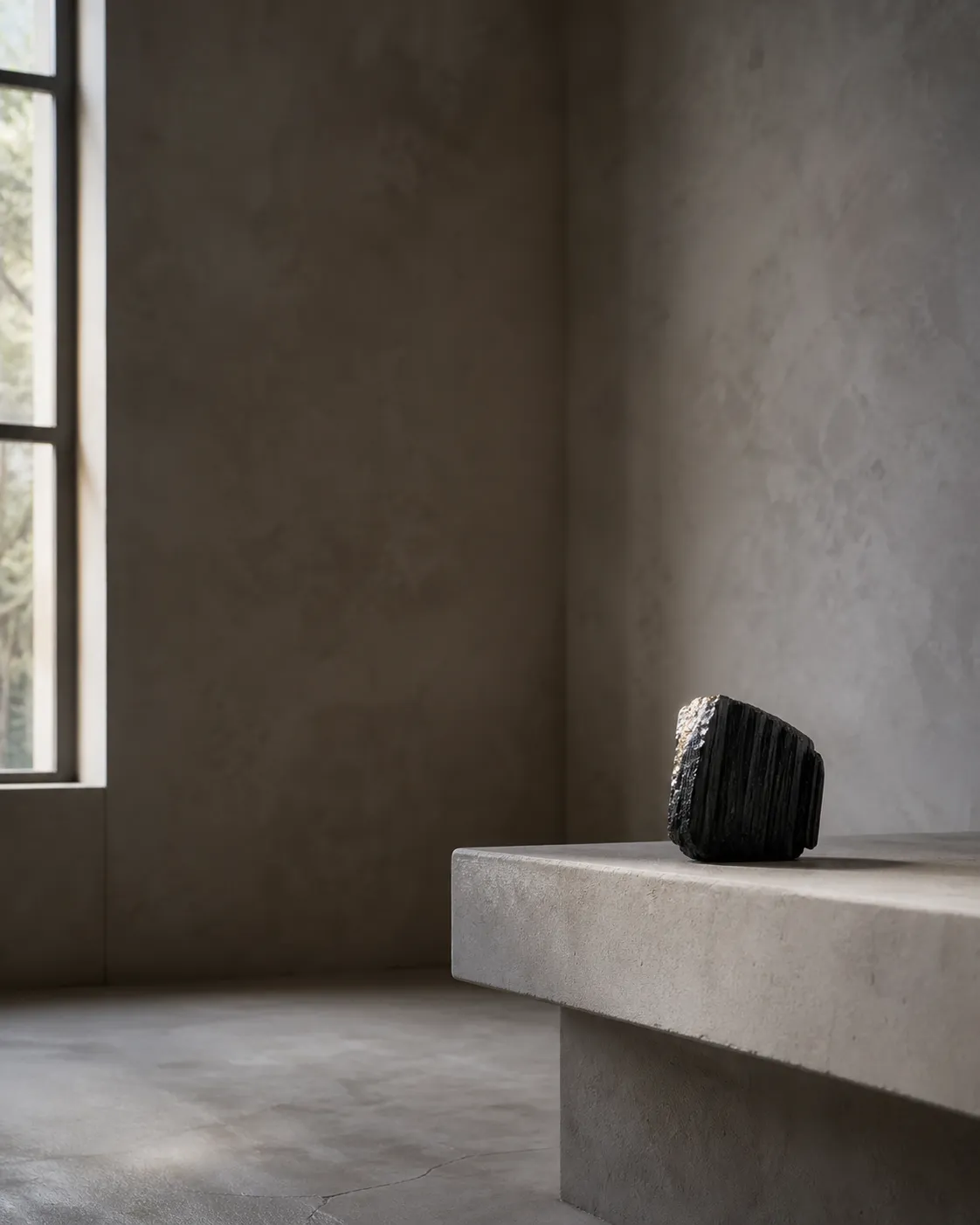
Why the Contrast Works
A monolithic interior can become too even. When walls, floors, shelves, and built forms share one quiet surface language, the room may feel composed but slightly sealed. Raw black tourmaline introduces another kind of presence: not shine, not pattern, not color decoration, but interruption by weight and surface.
Microcement and limewash are often chosen for visual continuity. In a design context, they can support seamless surfaces, softened transitions, and tonal restraint. A raw specimen does the opposite at a small scale. It catches shadow in crevices, holds an uneven outline, and reads as a compact dark point against pale, grey, taupe, clay, sand, or off-white surfaces.
The result is not maximalist drama. It is quiet tension. The room still reads as minimalist design, but the black mineral gives the eye a place to stop.
A polished black object can look sleek, but it may merge too easily with black-framed glazing, hardware, or contemporary accessories. A raw specimen carries a less manufactured visual language. That roughness helps a room of continuous finishes keep a natural point of friction.
Give Each Material a Clear Role
Microcement
Microcement is the architectural field in this article. It is discussed here as a continuous-looking interior surface, not as a specification for where it should be installed or how it performs over time. Those questions belong to product documentation, qualified installers, and project-specific guidance.
Limewash
Limewash brings softness. Its role is atmospheric rather than sharp: a surface that may appear chalky, mineral, cloudy, or light-responsive depending on finish and setting. That is editorial design language, not a claim about application method, durability, sustainability, or indoor air quality.
Raw black tourmaline
Raw black tourmaline becomes the small dark anchor. It can sit on a low shelf, stone plinth, bedside ledge, entry console, recessed niche, or simple block-like table. It needs enough negative space for its edge and surface to be seen. If many small objects crowd around it, the contrast weakens.
The pairing is strongest when each element has a job. Microcement and limewash should not compete with the specimen; the specimen should not be scattered until it becomes visual noise. A useful test is simple: does the tourmaline sharpen the room’s restraint, or does it merely add another object? If it sharpens the restraint, the placement is working.
Scale and Placement Change the Answer
The same specimen can feel precise, heavy, awkward, or decorative depending on scale. A small piece against a large seamless wall may disappear. A very large mineral on a narrow ledge may feel staged. The goal is not dominance; it is balance.
In a pale limewash room, one raw black tourmaline specimen can create a clear focal point. It often works well near a surface junction: where a wall meets a built-in bench, where a shelf cuts across a plastered plane, or where a niche already gathers shadow. These locations carry architectural attention, so the mineral does not have to fight for it.
In a darker microcement space, outline matters more. If the field is charcoal, graphite, or deep brown, the mineral may lose its edge. A lighter backing plane, a clean plinth, or side light can help the raw surface remain visible.
Distance also matters. From across the room, black tourmaline reads as mass and shadow. Up close, it reads as surface, striations, edge, and fracture. A good placement allows both readings.
For minimalist design, one strong specimen usually does more than a row of smaller pieces. Repetition can work, but it can also turn the mineral into styling rather than presence.
Keep the Palette Disciplined
Raw black tourmaline pairs most convincingly with microcement and limewash when the surrounding palette stays restrained. The point is not to match everything; it is to keep the field calm enough that texture can carry the contrast.
Soft whites, warm greys, stone beige, clay, muted taupe, and deep off-black can all support the pairing. The exact color matters less than the relationship between surfaces. Warm limewash can make the mineral feel grounded and architectural. Cooler microcement can make it read sharper and more graphic. If both surfaces are already highly varied, the specimen may become one more texture in a crowded field.
This is why tonal restraint matters. Raw texture needs quiet around it. Too many veined stones, glossy metals, patterned textiles, and saturated colors can weaken the mineral’s role. The specimen becomes part of a collection rather than a deliberate contrast.
Light is part of the palette too. A raw black surface can flatten under overhead light alone. Side light, window light, or a shaded recess can reveal more depth without turning the piece into a display object.
If the room already has many loud contrasts, raw tourmaline will not add clarity. If the room is restrained but slightly too even, it can add the right kind of edge.
Common Confusion: Visual Pairing Is Not Material Compatibility
Visual appeal is not a construction test
Saying that raw black tourmaline looks compelling beside microcement and limewash does not mean the materials have been tested together, approved for a certain environment, or verified as compatible in construction terms.
Placement is not a wellness outcome
Black tourmaline is often discussed in symbolic or somatic language, but this page does not claim that a specimen changes health, indoor conditions, electromagnetic exposure, or emotional outcomes.
Not every dark object reads alike
A polished black sphere, cut stone tile, cast ceramic form, and raw tourmaline specimen all behave differently in a room. The raw specimen is useful here because it keeps its irregularity.
This article is not an installation guide. It does not decide whether a specimen should touch a finish, sit in a wet area, rest on a delicate surface, or be placed near heat, water, or cleaning products. For a real project, use the finish manufacturer’s instructions, installer guidance, fabricator input, local requirements, and the documentation for the actual materials on site.
In a nervous-system-aware interior, black tourmaline may serve as a visual cue for weight, stillness, or pause because of how it looks and where it is placed. That is a subjective design interpretation, not a measurable result.
The raw specimen interrupts smoothness without asking the room to become decorative.
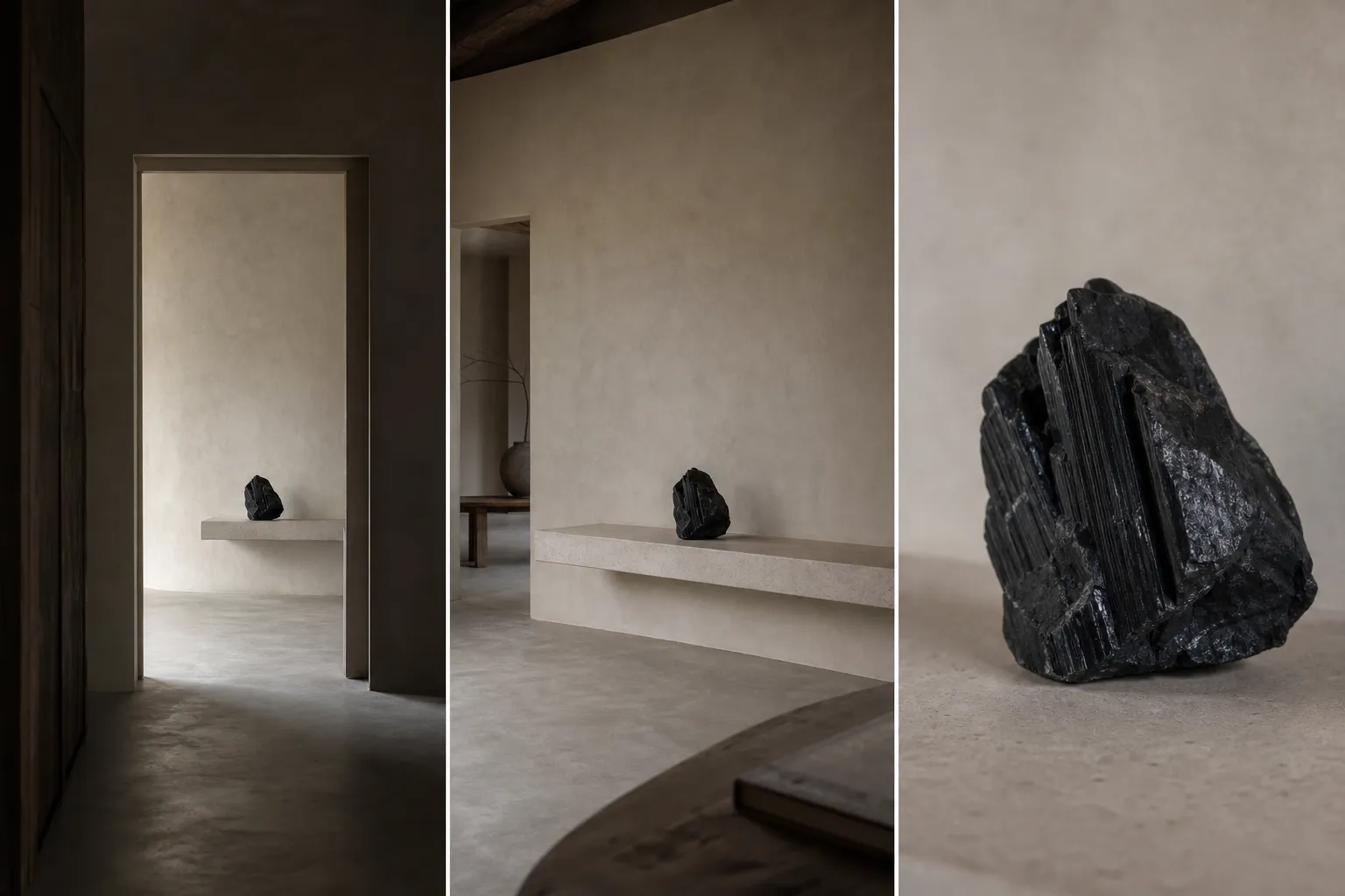
A Quick Composition Check
Before committing to the placement, look at the specimen from three distances.
From the doorway
It should read as a calm dark anchor. If it disappears, it may need a clearer backing surface, stronger silhouette, or less cluttered location. If it shouts, the scale may be too large or the contrast too abrupt for the room’s mood.
From standing distance
It should relate to a surface or architectural line. It might align with a shelf edge, sit below a wall light, occupy a niche, or rest on a simple plinth. Random placement weakens monolithic materiality because the object begins to feel applied rather than integrated.
From close range
The raw texture should still matter. The surface, edge, and shadow should explain why this mineral was chosen instead of another black object. If the surface cannot be read, the design loses its strongest reason for using raw tourmaline.
Then remove one nearby object. Minimalist interiors often improve when the strongest material contrast is allowed more space.
Where the Pairing Works Best
This pairing is most convincing in spaces where the architecture already carries restraint: a quiet entry, a plastered bedroom niche, a built-in shelf in a living room, a simple contemplative corner, or a low console against a limewash wall. In these settings, raw black tourmaline can act as a small geological punctuation mark within a broader field of softened surface.
It is less convincing where the room depends on many decorative layers. If there are strong patterns, saturated colors, glossy surfaces, and multiple sculptural objects, the tourmaline may still look attractive, but its specific dialogue with microcement and limewash becomes weaker.
It also needs care in high-use areas. A loose mineral specimen on a narrow ledge, busy counter, or floor-level surface may become impractical. This article does not assess suitability; it only notes that placement should respect ordinary movement, cleaning, contact, and use.
The strongest rooms let the mineral remain quiet. They do not over-explain it, over-light it, or make it the theme. They give it a clear plane, a restrained palette, and enough negative space for the contrast to register.
The Bounded Answer
Raw black tourmaline can pair beautifully with microcement and limewash when it is used as a small, dark, raw-textured counterpoint to seamless surfaces. The contrast works through scale, shadow, matte surface, tonal restraint, and careful placement within interior architecture.
The answer changes when the palette becomes crowded, the finish is too dark for the specimen to read, the object is undersized for the room, or the placement turns a quiet mineral into styling clutter. It also changes when the question moves from visual composition into installation, durability, moisture, safety, provenance, or verified material compatibility. Those claims sit outside the evidence available for this page.
Kept within its proper boundary, the pairing is simple: broad mineral-like surfaces create calm continuity; raw black tourmaline introduces a precise break in that continuity. The beauty is not contrast for its own sake, but one rough, dark object making a restrained room feel more awake.